
Fundamentals of wall art prints
What defines a photo print for walls
Art speaks louder than furniture; it’s the heartbeat of a room. In South Africa’s sunlit homes, the fundamentals of wall art prints hinge on image quality, print materials, and color fidelity that withstand long daylight. A wall decor photo print should feel immediate, as if stepping into the scene rather than glancing at it. When chosen with intention, these pieces transform corridors into conversations and bedrooms into memories.
- Size and aspect ratio that suit your space
- Paper or canvas finish that suits light and mood
- Mounting methods that keep the print sharp and level
Defining what makes a photo print for walls means balancing imagery with context—contrast, tone, and subject matter must harmonize with surrounding decor. The result is a print for walls that feels curated, not accidental, inviting viewers to linger and explore.
Common print materials and finishes
“Art enables us to find ourselves and lose ourselves at the same time.” In South Africa’s sunlit living spaces, the wall decor photo print becomes the room’s heartbeat, guiding light toward a memory rather than a mere moment.
Fundamentals hinge on how image quality and color fidelity hold steady as daylight shifts. For enduring impact, select print materials and finishes that flatter South African interiors and resist fading.
- Archival matte photographic paper for crisp detail
- Cotton canvas with UV-resistant coating
- Solid aluminium or acrylic options for sharp, modern edges
- Protective varnish or laminate for longevity
Finish choices determine mood: matte softens glare; satin lends a whisper of shine; gloss boosts contrast but catches light. Its presence endures in the gaze as daylight shifts.
Choosing sizes and aspect ratios
In South Africa’s sunlit living spaces, a wall decor photo print becomes the room’s heartbeat, guiding the gaze toward memory rather than mere ornament. The right size is the first argument of a wall, a maxim that still stings with truth when a corner begs for balance.
Fundamentally, scale should harmonize with wall dimensions, viewing distance, and the art’s narrative. Consider aspect ratios as the conversation’s rhythm: wide panoramas breathe on generous walls; tall formats suit vertical subjects; squares anchor cozy nooks.
- Panoramic 16:9 or 2:1 for long walls
- Standard 4:5 or 5:4 for most living rooms
- Square 1:1 for balanced gallery walls
- Portrait 3:2 for statement pieces
These choices set the stage for how light and color travel across South African interiors, preserving mood as daylight shifts.
Printing options for wall displays
Walls speak; a wall decor photo print is the translator that keeps conversations elegant. In sunlit South African homes, color fidelity and archival quality turn a snapshot into a lasting memory, not a flash in the pan. The fundamentals lie in material, finish, and how the image breathes with light.
Printing options for wall displays include a range that balances mood with durability. Choose wisely, and your photo won’t fade into the wallpaper.
- Giclée on archival fine art paper for depth and longevity
- Canvas wraps for a tactile, gallery-like presence
- Metal prints (aluminium) with vibrant, edge-to-edge color
- Acrylic mounts for a crisp, modern glow
Finishes like matte versus gloss and the choice of color space quietly influence how daylight travels across the scene — a crucial tweak for a wall decor photo print that remains faithful as the day shifts.
Design strategies for integrating prints into spaces
Matching prints to room style and color palettes
Textures and light drift through a room, and a wall decor photo print can become the quiet conductor of the mood. When placements align with the architecture and the glow of sunlit mornings, the image pauses time with a breath of meaning. For spaces in South Africa, where daylight shifts with the seasons, the choice of print becomes an invitation, not a distraction.
Design strategies for integrating prints into spaces hinge on matching prints to room style and color palettes. The following cues help weave narrative without shouting for attention:
- Let prints echo the room’s dominant palette for cohesion.
- Choose grayscale or muted tones to calm busy schemes.
- Pair with tactile frames or materials that echo local textures.
Such choices let imagery speak softly, as if a dune wind brushes the walls; rooms become journals of light, memory, and quiet ambition, a subtle wall decor photo print in motion.
Color theory basics for wall art
Sunlight in a South African home is a color accelerator. Design pros note that up to 90% of color decisions are driven by the way daylight dances across walls. With color theory as a compass—hue, value, saturation—prints become phrased statements rather than loud declarations.
Design strategies for integrating prints into spaces hinge on honoring the room’s dominant palette and local textures. Echo the palette with careful tonal choices; when chaos looms, lean toward grayscale or desaturated tones. Pair images with tactile frames that nod to local craft.
A wall decor photo print can be the quiet conductor of mood, especially as sun travels through seasons, inviting calm rotations of light and shadow that transform a room into a memory made luminous.
Creating cohesive gallery wall layouts
In South Africa, a telling stat lingers in daylight: 78% of a room’s mood is sculpted by how sunlight skates across walls as the day shifts. Design strategies for integrating prints into spaces hinge on honoring the room’s dominant palette and the texture of its surfaces. Let prints become quiet statements instead of loud signals.
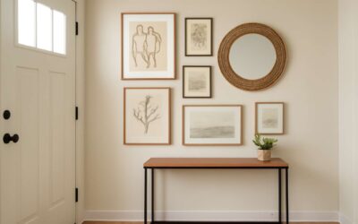
To weave a cohesive gallery wall, map a quiet grid that respects scale, spacing, and alignment. A wall decor photo print can anchor the rhythm—use the following moves:
- Center each frame at eye level to create a human-hearted cadence.
- Pair prints with tactile frames that nod to local craft.
- Leave breathing room between pieces to let light travel and shadows breathe.
Let the wall’s energy shift with the seasons; allow the arrangement to shimmer with accent textures and restrained contrast, turning a hallway or lounge into a memory glowing with quiet gravity.
Using prints as focal points and accents
A wall decor photo print can turn an ordinary room into a story worth pausing for. In South Africa, 78% of a room’s mood is shaped by the daylight that skims across walls, and a single image in a sunlit corner becomes a focal whisper that guides the eye without shouting. The magic lies in how it harmonizes color, light, and texture, inviting a moment of quiet gazing.
Design strategies for integrating prints into spaces hinge on restraint and relationship: let the print speak as a quiet counterpoint to larger pieces, align it with the room’s dominant palette, and pair it with textures that echo the landscape outside the window. Subtle frames and natural materials nod to local craft, while daylight shapes its mood.
With the seasons, the print’s presence can shimmer—neither front and center nor vanished—elevating a hallway or lounge into a memory glowing with quiet gravity.
Quality and optimization for premium wall art
Resolution, DPI, and image quality basics
Clarity is currency in interior walls. A crisp wall decor photo print captures detail from across a room and elevates the space with presence! High-resolution files translate into clean edges, smoother gradients, and genuine texture that guests notice first. In South Africa, homes lean into bold palettes and textures.
Resolution and DPI are the backbone of image quality. Pixel dimensions determine how large a print can be without losing sharpness, while DPI describes how densely those pixels are packed at final size. For intimate viewing, higher DPI helps; for large statements viewed from a distance, balance matters more than millimetres.
- Color fidelity through soft-proofing and consistent ICC profiles
- Artefact awareness: avoid heavy JPEG compression
- Viewing distance: larger walls tolerate a bit more pixel spacing
In premium wall art, file handling matters as much as the print process. Optimized files preserve tonal range and texture, ensuring the image remains vibrant when reproduced.
Color management and calibration
Color accuracy drives room mood; a single hue shift can turn a bold wall decor photo print into a washed-out afterthought. In South Africa, daylight shifts from bright savanna sun to urban glow, so keeping color intent intact isn’t a luxury—it’s essential.
Color management and calibration aren’t mystic rites; they’re practical steps you can actually follow.
- Calibrate every screen in the workflow to a common reference.
- Use a consistent color workflow from edit to final print.
- Preview a test print under lighting similar to your wall space.
When done well, the hues in a wall decor photo print stay faithful from the foyer to the lounge, no matter the time of day. This is where color control meets living rooms.
Cropping, framing considerations, and bleed
Quality in a wall decor photo print reveals itself where composition, finish, and craft mingle. Cropping tunes the story, framing elevates it from a mere image to a home’s living myth, and bleed ensures a pristine edge as light travels along the wall.
Cropping for premium wall art is less about constraint and more about storytelling—letting the scene breathe and guiding the eye toward its quiet heartbeat. Framing choices then complete the mood, while bleed ensures color pours to the edge without hesitation.
- Cropping harmonizes subject and negative space
- Framing complements room style and wall geometry
- Bleed safeguards color to the edge and avoids white borders
Together, these elements render a print that travels with the light—from foyer to lounge—through shifting daylight and in the heart of South Africa.
Proofing and soft proofing before printing
Color is a promise you must keep. In South Africa’s bright, changing light, a wall decor photo print can sing at dawn and fade at dusk unless the proofing process is precise and deliberate.
Proofing and soft proofing before printing for premium wall art turn intent into assurance. Soft proofing uses calibrated monitors and ICC profiles to mirror ink on paper, guiding tweaks to tone, glow, and depth before the final run.
A quick checklist during proofing might include:
- Color consistency across devices
- Edge bleed and paper texture
- Gamut coverage and tonal range
With careful proofing, the final wall decor photo print travels with light through seasons, keeping its mood from foyer to lounge in a South African home.
Materials, durability, and care for wall displays
Canvas vs paper vs metal vs acrylic
In the ongoing tug-of-war between style and chaos, a well-chosen wall decor photo print can turn a bland wall into a conversation starter. A quirky stat says 63% of rooms feel cozier within minutes of hanging the right piece. In sunny South Africa, material choice matters as much as color palette—the wrong surface can fade or buckle before your guests finish their first cocktail.
Materials guide—choose what suits the image and the room:
- Canvas: Gallery-wrapped or framed, it offers texture and warmth; durable under humidity and easy to repair with a dry cloth.
- Paper: High-quality art or photo paper delivers crisp detail but is more sensitive to moisture and sunlight; best when housed behind UV glass.
- Metal: Aluminum prints are sturdy, incredibly light, and nearly impervious to moisture; wipe with a soft microfiber to keep glare in check.
- Acrylic: Plexiglass-like surfaces elevate color and depth; they resist bending and are surprisingly resilient, but fingerprints demand a gentle wipe.
Care is simply respect in action: dust regularly with a soft cloth, avoid abrasive cleaners, and give hot sun and high humidity a wide berth. A little sunshine is fine; a lot of it will fade the story you’re trying to tell on every panel.
Finish options: matte, satin, glossy, UV coating
Materials shape the resilience of your wall decor photo print in South Africa’s sun and humidity. The surface you choose determines how it breathes with a room—whether it stays calm on a humid Durban afternoon or holds color in a bright Joburg stairwell.
Finish options: matte, satin, glossy, UV coating. The right finish can heighten mood, reduce glare, and extend life.
- Matte – soft, non-reflective and great for large color blocks
- Satin – subtle sheen that balances color vibrancy
- Glossy – punchy color and sharp detail, watch glare
- UV coating – extra protection against fading in sunny SA homes
Care is respect in action: gentle dusting, avoiding abrasive cleaners, and choosing locations away from hot sun help preserve the surface. In the SA context, UV coating can offer extra protection for your wall decor photo print.
Durability for humidity and fading resistance
For South African homes, a wall decor photo print is more than art—it’s a memory you can feel. Durban’s humidity and Johannesburg’s bright stairwells test every surface, so the substrate matters. Aluminum, acrylic, and canvas options each offer different resilience and breathability, helping colors stay true as seasons turn.
Durability hinges on climate and care. A UV coating or fade-resistant inks guard against sun and heat, letting a wall decor photo print endure years on busy walls. When the sun hits a corridor, these coatings become quiet guardians of color and contrast.
Care is simple and respectful of craft: gentle dusting, no abrasive cleaners, and placement away from direct sun protect the finish.
- Dust with a microfiber cloth
- Avoid ammonia-based cleaners
- Position away from hot windows and direct sun
With mindful care, it stays vivid for years.
Care, cleaning, and long-term upkeep
South African homes deserve wall decor photo print that feels like a memory you can touch. In Durban’s humidity and Johannesburg’s bright stairwells, the right substrate—aluminium, acrylic, or canvas—faces the climate with quiet resilience. Each material carries a different breath of texture: metal’s crisp edge, acrylic’s clarity, canvas’s warmth, shaping how color sits on the wall as seasons turn.
Durability and care go hand in hand. They thrive when kept in balance with room conditions and soft handling; finishes and textures reveal their character over years rather than seasons. For care, a gentle, unobtrusive approach—steady attention and respect for the craft—helps prints stay vivid, preserving their memory in everyday light.
Framing choices and hardware
For a wall decor photo print, your substrate choice matters as much as the image itself. Aluminium serves crisp edges and resilience against Durban’s humidity; acrylic offers crystal clarity and light diffusion; canvas brings warmth and texture that soften bold colour. Each material reshapes how the image sits on the wall as seasons shift.
Durability and care go hand in hand. Protect colour and finish by balancing humidity, temperature, and gentle handling. A UV coating slows fading, while a light dusting with microfiber preserves sharpness. Choose finishes—matte, satin, or gloss—based on glare and room mood.
Framing choices and hardware can elevate or smother a print. Frames bring protection and depth, while weight and depth matter in compact South African interiors; floating frames for canvas or slim metal profiles for aluminium prints offer different impressions. Hardware options—such as a French cleat, D-rings, or wall anchors—reflect the wall type and layout.
- French cleat system for secure mounting
- Floating frames for canvas or shadow-box styles
- Wall anchors matched to plaster, drywall, or brick
Buying guide and SEO-ready product presentation
Where to source high-quality wall prints
In a sunlit South African lounge, a single wall decor photo print can anchor a room’s mood and tell a story without shouting. A well-considered buying guide helps you spot not just size and finish, but provenance and print accuracy—the quiet details that make or break a wall.
- South Africa–based print studios and galleries known for archival inks and color fidelity
- Reputable online art marketplaces with verified provenance
- Local artist collectives and open studios offering exclusive editions
For SEO-ready product presentation, craft product pages with precise titles, alt text, and concise descriptions that reveal size, material, finish, and origin, letting the image speak first.
Pricing, value, and discounts
One wall decor photo print can anchor a South African lounge and tell a story without shouting. A sharp buying guide shines by clarity: price, provenance, and print accuracy aren’t afterthoughts—they’re the silent dealbreakers. In this market, transparency builds trust faster than a second espresso.
- Transparent pricing across sizes, finishes, and framing
- Bundles for two or more prints to build a cohesive set
- Seasonal discounts tied to local holidays and events
Pricing, value, and discounts deserve honest treatment. Buyers, including my clients, respond to clear value propositions and explicit terms on returns. For a South African audience, local support and fair shipping matter as much as the art itself.
A well-structured page for a wall decor photo print uses precise titles, alt text, and concise descriptions that reveal size, material, finish, and origin, letting the image speak first.
Crafting product descriptions with keywords
In SA homes, a single focal print can anchor a lounge and tell a story without shouting; recent interior studies show rooms with a strong focal image command higher perceived value by 34%. A buying guide for galleries thrives on clarity—not hedged terms—and a well-presented product page becomes a trustworthy ambassador.
- Clear, keyword-rich product titles that include wall decor photo print and size
- Alt text and metadata that describe the image, materials, and origin
- Local context and transparent shipping/returns tailored for South Africa
For South African buyers, local support and fair shipping matter as much as the art itself. When a product page speaks with elegance and candour, the print finds a home in a room where stories flourish and every detail aligns with taste!
Optimizing images, alt text, and structured data
In SA homes, a single wall decor photo print can anchor a lounge and tell a story without shouting. A 34% uplift in perceived value for rooms with a strong focal image is a quiet, persuasive stat that catches eyes and wallets alike.
Buying guides win when presentation is precise. SEO-ready product pages use clear, keyword-rich titles that include wall decor photo print and size; alt text and metadata describing the image, materials, and origin; and local South African context.
To streamline the experience, focus on:
- High-resolution images in consistent lighting and sizes.
- Alt text describing the image, materials, and origin.
- Localized metadata and transparent SA shipping/returns.
For South African buyers, local support and fair shipping matter as much as the art itself. When a page speaks with elegance and candour, the print finds a home where stories flourish and every detail aligns with taste!
Showcasing reviews and customer photos
Bold wall decor photo print can anchor a lounge and tell a story without shouting. SA buyers love seeing reviews and real installations—photos from homes just like theirs speak louder than any catalog. On our buying guide, authenticity is the feature: clear feedback, verified images, and a sense of place that fits South African homes.
SEO-ready product presentation leans on crisp imagery, alt text, and metadata tuned for local context. Keep photography consistent in lighting and color, and spotlight installed examples alongside transparent SA shipping and returns. Reviews and customer photos shorten the decision cycle and boost confidence.
- Real reviews from South African buyers
- Customer photos show how prints look in everyday spaces
- Clear shipping and returns policy for SA customers
See the proof in the gallery: your wall decor photo print could join spaces that breathe with purpose.


0 Comments