
Comprehensive guide to wall art prints for interiors
Choosing print size and scale for different rooms
Walls aren’t mere backdrops; they’re the stage for conversation. In South Africa, wall decor prints can swing a room from meh to memorable with a whisper and a wink. This comprehensive guide to wall art prints for interiors nudges you to think about print size and scale as smart, not scary, design decisions.
Size and scale aren’t about trendy ratios; they’re about proportion to the space and the eye catching the first glance. To keep things harmonious, consider these broad factors:
- Room proportions and wall area
- Viewing distance and focal points
- Color harmony and contrast with the palette
Whether your living room is airy and sun-soaked or compact and cosy, the right print size can anchor a conversation without shouting. Ultimately, they should feel inevitable, like they were always meant to be there—part art, part architecture, all personality.
Color strategy for wall art to harmonize with décor
Color is the quiet conductor of mood, and in South African homes it can turn a room from ordinary to orchestral with a single stanza of light. A thoughtful color strategy for wall art is less about chasing trends than about nurturing a harmonious conversation between prints and the room’s warmth. These wall decor prints should feel inevitable, a natural echo of textiles, wood, and sunlit walls. When the palette is chosen with intention, space breathes and every glance at the wall becomes a small revelation.
To craft that harmony, start with your dominant color from upholstery or rugs, anchor with a neutral backdrop, and let a single print carry the complementary accent. Heed undertones and lighting: warm lamps invite prints with golden notes, while daylight favors crystal blues and greens. The result is art that feels inevitable, part of the room’s architecture, not an afterthought.
Framing, mounting, and display options
In South Africa, a recent interior-design survey found that the framing of wall decor prints shifts a room’s mood more than any single shade. Framing turns a print into a narrative, a quiet hinge between sunlight and furniture that invites a closer look and a slower breath.
- Floating frames in warm oak or matte black steel for a contemporary edge
- Traditional beveled or archival wood for classic elegance
- UV-protective glazing and acid-free mats to preserve colour and detail
Mounting choices range from discreet gallery rails to bold cable systems that let large walls tell a story without crowding the space. In South African homes with plaster, brick, or timber features, the relationship between print and wall is tempered by the mounting ethos and the surrounding architecture. Viewed in the right light, wall decor prints become a living conversation between wall, window, and warmth.
Buying high-quality wall art prints: what to look for
A single print has the power to steer a room’s mood more than a hundred swatches. In my experience, this comprehensive guide helps you buy high-quality wall decor prints that endure. Look for clarity of detail, true color, and a sense of place that matches South African light and texture.
Key markers of quality include:
- acid-free, archival paper that resists ageing
- pigment-based inks for depth and longevity
- giclée or high-resolution reproductions with consistent colour
These details influence how a print polishes a room over years.
I look for provenance, edition size, and licensing when shopping for prints. Prefer retailers who offer colour-accurate proofs, archival papers, and clear care instructions; compatibility with your space matters as much as the image itself. Supporting local studios adds warmth to a home and community.
Modern minimalist prints: defining characteristics and placement tips
Precision reshapes a room’s mood faster than swatches. In this comprehensive guide to wall art prints, I find modern minimalist prints becoming quiet protagonists, shaping space with restraint and texture. South African light softens edges, letting lines breathe and walls hum with possibility. These wall decor prints carry the tempo of a home.
Minimalist prints hinge on clarity: clean geometry, deliberate negative space, and a restrained palette that speaks in subtleties. The best pieces feel timeless, their colour faithful and texture honest.
- clean geometry with precise alignment
- consistent, high-contrast detail in print
Placement becomes a dialogue with light, scale, and textiles, letting a single piece anchor a corridor or steady a shelf’s rhythm, especially where warmth and texture define the room.
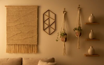
Bohemian and botanical prints: pairing with textures and patterns
South African interiors prove a bold claim: wall decor prints transform a room in moments, yet never shout to be noticed. Bohemian whimsy and botanical calm meet in a dialogue of texture and line, guided by light that slows edges and invites tactility to speak.
Pairing with textiles and patterns is where the magic happens:
- Layer linen, jute, and sisal with woven textures to create tactile depth.
- Use earthy palettes—ochre, terracotta, olive—that let greens and botanicals breathe.
- Balance bold botanical motifs with generous negative space to avoid visual fatigue.
Viewed in a sunlit corridor or softly lit lounge, bohemian and botanical prints speak in whispers and wit, offering curated energy without drama. These wall decor prints anchor rooms with character and ease.
Abstract and geometric designs: creating focal points
A recent design survey found 63% of homeowners say a single abstract or geometric wall decor print changes a room’s mood in under an hour! A well-chosen print acts as a visual nucleus, drawing the eye and guiding the rest of your decor. In South African homes, these pieces lend structure to open-plan spaces and temper exuberant colour with quiet geometry. When used with textiles and natural light, wall decor prints become a calm counterpoint to bold sun.
- Place above a dominant seating zone to anchor the room.
- Pair high-contrast framing or matting to sharpen the focal point.
- Let surrounding neutrals breathe to avoid visual fatigue.
Abstract and geometric designs demand light that sculpts edges. In sunlit corridors or relaxed lounges, these wall decor prints offer a focal point without shouting, inviting conversation and sense of order that feels earned, not imposed.
Vintage and retro-inspired prints: mixing eras in a space
Vintage and retro-inspired prints offer a sly spectacle in interiors. A design survey reveals 54% of homeowners say one well-chosen vintage print anchors a room within an hour, marrying memory with modernity. Mixing eras creates a layered narrative, where a faded travel poster from the 1960s might whisper alongside a crisp 1980s graphic. In South African homes, these wall decor prints ground open walls and temper exuberant palettes with a quiet patina.
- Storytelling over sameness: mix eras around a shared motif.
- Repeat a single color to create cohesion across pieces.
- Respect spacing to let each print breathe and glow.
Under soft daylight, these pieces glow with character, pairing beautifully with textures and natural materials. The result is a refined, diary-like wall that speaks of place, history, and possibility.
Monochrome and black-and-white prints: versatility across rooms
Monochrome wall decor prints anchor a room within an hour, a design survey reveals 54% of homeowners feel the magic at once. In sun-washed South African homes, the black-and-white refrain acts as a quiet conductor, guiding color, light, and mood.
These prints cross rooms with ease—living rooms, study nooks, and entryways—creating a grounded rhythm without stealing the scene.
- Living spaces crave calm, where legible shapes become focal points
- Home offices benefit from clarity that nurtures focus
- Hallways and dining zones gain polish from restrained contrast
Under soft daylight, they glow with character, pairing beautifully with textures and natural materials. The result is a timeless wall narrative—quiet, deliberate, and full of place!
Canvas vs paper prints: choosing the right medium for your space
Canvas vs paper prints: choosing the right medium for your space can tilt a room’s vibe faster than a switch is flipped. I’ve seen it—one placement and the room breathes. In sun-washed South African homes, canvas adds texture and warmth, while paper delivers crisp color under bright daylight. A recent survey places the impact of wall decor prints at 54% the moment they’re hung.
Texture or clarity—light will tell the truth. The weave of canvas catches shadow; paper keeps edges razor-sharp. For coastal rooms, durability matters; for study nooks, legibility wins. Consider these nuances as the light shifts:
- Texture and depth vs. ink clarity
- Durability under humid coastal air
- Framing compatibility with existing architecture
Ultimately, the choice shapes the room’s quiet narrative—canvas for atmosphere, paper for detail—allowing wall decor prints to speak without shouting. In SA homes, the right medium feels almost supernatural, guiding light and mood with effortless grace.
Finishes and textures: matte, satin, glossy effects and care
A recent survey places the impact of wall decor prints at 54% the moment they’re hung, and the room’s mood tilts with the light. Finishes and textures do more than decorate; they bend a space’s breath and memory. For South African homes, matte, satin, and glossy effects offer distinct atmospheres and practicalities for wall art prints.
- Matte: soft diffusion of light; glare tamed; fingerprints less visible for intimate wall art prints.
- Satin: gentle sheen; balanced light and color; easy to wipe, resilient in humid spaces.
- Glossy: bold color and high reflectivity; dramatic in controlled lighting.
Care is the quiet craft of longevity. Dust with a microfiber cloth, avoid harsh chemicals, and shield pieces from direct sun. Framing with UV-protective glass or acrylic and controlling humidity will keep wall decor prints luminous for years.
Framing options: ready-to-hang vs custom frames and their impact
Framing is the quiet hinge between art and atmosphere. Ready-to-hang wall decor prints can light up a hallway in minutes, while a custom frame invites a closer, almost conspiratorial look at the details. In South African homes, the frame’s profile determines how bold color travels and how memory lingers on the wall.
Options offered by framing can steer the room’s temperament as decisively as the print itself. Consider these practical divides:
- Ready-to-hang: instant impact, lower cost, simpler mounting.
- Custom frames: tailored proportions, matting, and UV-protection for longevity.
What matters is how the chosen frame and print interact with light, texture, and the space’s story. I’ve seen the right pairing make prints feel purposeful, not decorative, and keep the moment of discovery alive for years to come!
Durability and care tips for wall art prints to extend life
South African interiors crave character, and wall decor prints set the tone in seconds. A compelling print can make a corridor feel taller, a lounge cozier, and a memory linger long after guests leave. Durability matters because a single piece carries stories across decades.
Durability hinges on archival inks, museum-grade substrates, and UV-protected glazing. When a print respects these basics, colours stay faithful, blacks stay deep, and edges resist yellowing. Pairing this with acid-free mats and archival backing gives longevity without shouting for attention.
Careful consideration of the display environment matters more than frequent dusting. Consistent light levels and stable humidity help preserve tone and detail. A quality frame not only frames the art; it shields wall decor prints from aging.
Consider these pillars of longevity:
- Material quality and archival standards
- Framing, glazing, backing
- Display environment and light management
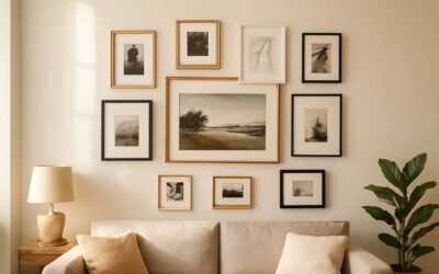
Grid layout vs salon-style gallery walls: planning methods
Grid layout vs salon-style gallery walls—two paths to immediate character. A strict grid brings calm, while a salon wall injects energy and story. In South African interiors, wall decor prints can transform a hallway in minutes, shifting mood and perception.
Key planning levers include:
- Anchor points at eye level and equal spacing to create rhythm
- Mixing frame sizes and print scales for visual interest
- Accounting for wall color and natural light to avoid glare
Whether the choice leans grid or asymmetrical, the aim is balance. A thoughtful arrangement respects architectural lines while letting artwork guide the eye. Floor tests, paper cutouts, and simulated sightlines help ensure the display lands with intention.
Color coordination and rhythm in a gallery wall
A hallway in a Cape Town home can glow with a single, well-chosen wall decor prints. A bold print reshapes mood in moments—“art is a room’s breath,” as a designer likes to say—and light-washed walls in SA make the choice sing.
Color coordination goes beyond matching; it’s a dialogue of hue, tone, and architecture. This approach blends color with silhouette, turning a corridor into a narrated gallery.
- Bold accents paired with soft neutrals to guide the eye
- Print sizes varied to create a gentle diagonal rhythm
- Colors tested under natural light to preserve true tones
The result is a flexible canvas for expression, perfectly suited to South African homes craving personality without vanity.
Spacing, alignment, and measurement tips for cohesive walls
Art shifts a room’s rhythm in an instant, and wall decor prints do it with quiet authority. A bold statement can wake a quiet corridor, while a refined print anchors light and movement. In South Africa’s sunlit homes, the way prints relate to walls and furniture often makes a hallway feel curated rather than cluttered.
This comprehensive guide treats wall decor prints as living elements, where spacing, alignment, and measured relationships knit spaces together. Consider how margins breathe, how lines from doorways and furniture guide placement, and how consistent gaps create a cohesive wall story.
- Eye-level alignment to guide the eye without friction
- Breathing space around each piece to avoid visual crowding
- Proportional scale that echoes architectural lines
Practically, view a wall as a landscape—let the rhythm rise and fall across frames, not in a rigid grid but in a composed dialogue with natural light and texture.
Lighting considerations to elevate wall prints
Wall decor prints deserve a stage, and lighting is the director. This comprehensive guide to wall art prints for interiors treats lighting as a design lever that heightens color, texture, and mood, not just visibility. In South Africa’s sun-soaked homes, how a print catches light can tilt from serene to electric in an instant, so every watt counts.
Light strategy in three beats:
- Natural daylight framing: position prints to catch even, diffused daylight while avoiding harsh glare.
- Layered lighting: combine ambient, task, and accent lights so the print reads at any hour.
- Bulb tone and angle: opt for 2700–3000K for warmth and tilt fixtures to minimize reflections.
Test with a dimmer, watch reflections, and note how the print’s presence shifts with shadow and sun. A mindful lighting plan makes wall decor prints feel curated rather than cluttered.
Keyword optimization and product descriptions for prints
Wall decor prints turn a room into a story and a mood into a memory. “Walls speak in color when light arrives,” a local designer notes, and the truth shows in every corner that breathes with a new print.
To optimize for search, product descriptions should lead with feeling and then ground it in concrete details: size, orientation, medium, and finish. Include a hint of provenance or artist voice, and weave in the term wall decor prints so readers recognize the catalog at a glance.
In South Africa, daylight can tilt the view of a print from serene to electric. Describe how a piece interacts with natural light, framing, and a room’s color rhythm—narrative cues that help buyers imagine the print in their own space.
Image optimization, alt text, and visual search strategies
One striking stat: image-first decisions drive a majority of online décor purchases. Images are the room’s first language, and for wall decor prints, optimization is a doorway to discovery rather than a mere checkbox. In South Africa, daylight can tilt a print from serene to electric, so the visuals should hint at how framing and color breathe across hours. A thoughtful alt text frame — describing scene, light, and mood — helps both human readers and search bots understand the piece. This section champions image optimization, alt text, and visual search strategies that elevate wall decor prints beyond the thumbnail.
- Preserve pixel integrity, color fidelity, and lighting consistency across devices.
- Describe assets with descriptive, locale-aware naming to enhance indexing.
- Craft alt text that narrates scene, lighting, and mood while staying natural and searchable.
To ride the wave of visual search, publish consistent metadata and image context across product pages, and embrace platforms like image search and Pinterest. When color stays faithful from Cape Town to Knysna, the dream of the print travels with the user, turning a scan into a felt sense of space. The catalog speaks with quiet confidence, inviting browsers to imagine the artwork as part of their room’s rhythm.
Local sourcing and ethical printing practices
A striking stat anchors this field: image-first decisions drive the majority of online décor purchases. For interiors, trust is as important as taste—especially in South Africa, where local provenance and responsible production shape what ends up on the wall. This section guides readers toward local sourcing and ethical printing practices, balancing quality with accountability from studio to space.
- Support for local artists and South African cooperatives
- Printed with responsibly sourced materials and low-impact inks
- Transparent supply chains and fair-wage partnerships
By foregrounding these principles, you create spaces that feel authentic and lasting. This is your compass for wall decor prints that marry aesthetics with local ethics.


0 Comments