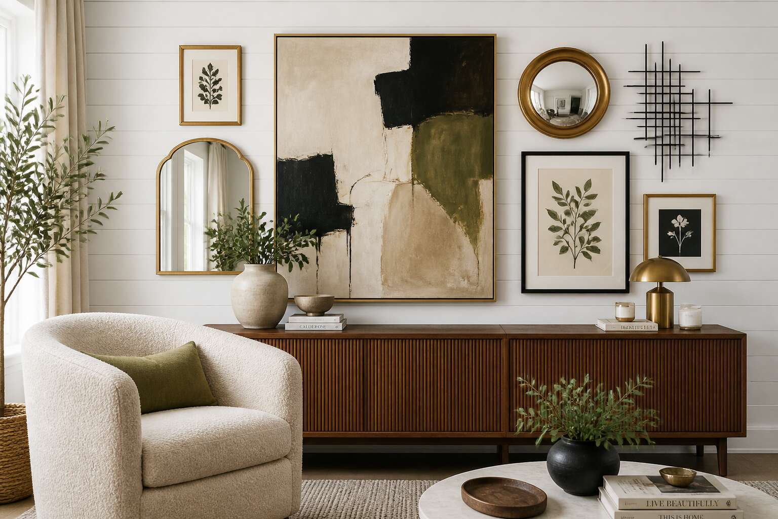
Understanding Wall Decor Styles
Minimalist and Modern Approaches
Your walls are not silent surfaces. They are the first thing you see when you wake, the backdrop to your quietest moments, and the final impression you leave on a guest. A space stripped of visual noise offers a rare form of psychological relief. Minimalist wall decor design is not about emptiness; it is about intention. Every piece you choose must justify its place, earning its square footage through function or profound beauty.
The modern approach borrows this discipline but adds a layer of raw materiality. It is less about stark white rooms and more about honest textures and bold, singular forms. When you select a piece for a modern interior, you are looking for a conversation starter that does not shout. The goal is a curated silence, where a single abstract canvas or a sculptural shelf holds immense power.
Consider the facets of a modern aesthetic:
- Material honesty, where exposed wood grain or raw metal is celebrated over painted finishes.
- Functional art, like a wall-mounted desk that doubles as a visual anchor.
- Negative space as a design element, allowing the wall to breathe.
This is where wall decor design becomes a form of self-editing. You are not decorating to impress; you are curating to feel. The modern ethos rejects the clutter of mass-produced trinkets. It asks for fewer, better things. It forces a confrontation with your own taste, stripping away the safety of covering every inch. The result is a home that reflects a clear, unburdened state of mind, where every sightline offers a small measure of peace. It is the difference between a room that holds objects and a room that holds meaning.
Rustic and Farmhouse Charm
There is a specific price point where dented wood becomes a premium product. Rustic farmhouse wall decor design is the art of paying homage to wear and tear without actually apologising for it. I respect that. You are not restoring anything. You are celebrating the patina, the dents, the rust, the dubious stains that make a room feel lived in.
The farmhouse aesthetic works because it rejects the showroom. It favours objects with a history, real or imagined. In South Africa, that often means:
- Reclaimed Yellowwood shelving
- Corrugated iron wall panels
- Vintage enamel jugs used as vases
- Hand-carved mirrors with forgotten origins
These pieces do not whisper. They stake a claim and stay. The best wall decor design responds to your messy life, not the other way round.
Eclectic and Bohemian Vibes
Matching decor is a quiet admission that you ran out of ideas. Eclectic and Bohemian vibes are the opposite. They are a celebration of visual noise, a deliberate collision of textures and eras that somehow finds harmony. This wall decor design approach is not about curation. It is about collection, where a Balinese mask sits next to a Soweto street art print and the room is better for it.
The Bohemian style leans on travel and memory. It is the wall that tells a story of where you have been. The Eclectic style, however, is more formal. It is a curated chaos, a careful arrangement of opposites that requires a sharp eye to pull off without looking like a flea market explosion.
For a space that leans bohemian, consider layering these elements:
- Macramé wall hangings with raw, unbleached cotton
- Woven baskets in varying scales to create depth
- Textile tapestries from Morocco or Turkey
- Gallery walls that mix vintage frames with contemporary canvases
The secret to this specific wall decor design is the tension between objects. A sleek, modern frame can hold a piece of antique fabric. A rough, untreated wooden shelf can display a polished ceramic vase. The result is a space that feels alive, never static. It is a room that invites conversation because it looks like it is mid-thought. You are not staging a room for sale. You are building a personal archive.
Classic and Traditional Elegance
In 19th century Cape Town, a gilded frame could cost more than a month’s wages, yet families hung them anyway. Classic and traditional elegance in wall decor design does not retreat; it asserts lineage through symmetry, dark wood, and oil paintings that have outlived their subjects. This is the room where a family narrative is pinned to the wall without apology.
Consider the weight of a carved cornice or the dense weave of a hand-stretched canvas. I have seen a single portrait suffice for an entire wall, and a traditional wall decor design avoids visual clutter. It prefers a measured arrangement: paired sconces, a single ancestral portrait, perhaps a collection of sepia photographs in identical frames. These choices are not nostalgic. They are deliberate ordering against chance.
For a truly classic composition, you might include:
- Gilded frames with gesso detailing
- Linen or silk wall coverings
- Antique brass or bronze ornaments
Choosing the Right Wall Decor for Your Space
Assessing Room Size and Scale
The difference between a room that feels composed and one that feels off-balance comes down to proportion. A single large canvas suits a wide lounge wall, while a narrow passage demands smaller, spaced pieces. This is the essence of wall decor design: matching the object to the space it occupies.
In South African homes, open-plan living areas dominate, so walls compete with furniture for attention. Viewing distance matters as much as wall dimensions. A piece seen from three metres away needs bolder proportions than one viewed up close. In my experience, proportion problems trace back to skipping the measuring tape.
Use these measurements:
– Multiply the wall width by 0.6 for ideal artwork width.
– Keep 15 centimetres between frames in a gallery arrangement.
– Hang the centre of any piece at 150 centimetres from the floor.
These numbers prevent oversized pieces that overwhelm and undersized pieces that disappear. Wall decor design responds best to the architecture around it.
Matching Color Palettes and Themes
One local retailer estimates 60% of South African shoppers buy wall art before considering their existing palette. That explains the beige wall catastrophe I witnessed in a Sandton apartment, where a neon abstract clashed with a leather recliner! Wall decor design should borrow from colours already present, not introduce a rogue hue that competes with the sofa.
Start with dominant fabrics, then pull accent tones. Apply the 60 30 10 rule to artwork selection. Wall decor design acts as the finishing layer, so it should harmonise with the palette rather than dominate it.
For themes, match the visual language of the room. Coastal rooms need muted blues and sandy neutrals. Industrial spaces call for charcoal and rust. Here is a simple breakdown:
– Use artwork that repeats two colours from the room.
– Limit metallic frames to one finish per wall.
– Let the largest piece dictate the theme for smaller accents.
Matching palettes keeps the eye moving without landing on a visual dispute.
Considering Functionality and Mood
Interior designer Lindiwe Mokoena told me that in Johannesburg, roughly seven out of ten clients ask for a “statement piece” before they have measured the wall or considered how the room is actually used. We treat wall decor design as a visual event, yet we forget it is also a functional shadow. A heavy mirror above a cramped dining table can turn every meal into an interrogation. A jaquard tapestry in a room where you read will fight with the page for your attention.
Functionality asks what the wall must absorb: noise, light, movement, or absence. A hallway with peeling plaster benefits from a shallow, framed textile rather than a fragile canvas. A study where you draft contracts needs a piece that dulls the room’s libido, not one that starts arguments with your concentration. The mood you seek is conjured through this quiet negotiation.
– Does the piece offer structural gravity or visual relief?
– Will it direct foot traffic or slow it down?
– Does it hold the room’s silence, or does it ask for conversation?
For a Cape Town lounge that faces evening winds, choose a textured fibre work that absorbs the slap of draughts. The observer’s mood follows the wall’s response to these demands. If the art merely occupies space, the room feels vacant. If it aids the room’s purpose, the mood settles into something like belonging. Wall decor design should serve the quiet rituals of the space.
Mixing Different Types of Wall Art
Blending a woven sisal panel with a slick metal sculpture might feel like a stylistic gamble, yet in a Durban apartment it can produce a wall decor design that vibrates with coastal tension. I have learned that the secret lies in pairing materials that share a visual weight, not a matching hue. For example:
- Hang a large textile as an anchor, then offset it with small ceramic discs.
- Use a single bold frame to break up a gallery of identical prints.
- Layer a mirror beside a charcoal sketch to add depth without clutter.
The interplay of shadow and texture turns a flat surface into a narrative. In Cape Town, where light changes every hour, mixing matte and gloss finishes keeps the eye moving. The wall decor design should feel like a conversation between objects, not a monologue. Choose pieces that echo the room’s rhythm, whether that is a rhythmic beadwork panel or a quiet watercolour. When you mix with intention, the wall becomes a living index of your taste.
Incorporating Personal Photography
I have learned that your phone’s camera roll holds more authentic wall decor design potential than any gallery storefront. A photograph of a Table Mountain hike or a Soweto street scene carries a specificity that generic prints cannot replicate. The first rule is to edit ruthlessly. Only select images with sharp focus and strong composition, otherwise the wall will look cluttered and unfocused.
When incorporating personal photography, treat the frames as part of the architecture. Consider the room’s natural light and the wall’s existing textures. A single large canvas of your own work can anchor a space better than any purchased piece. For a more dynamic arrangement, use a sequence of related shots.
- Choose prints with a consistent colour temperature.
- Mount them at eye level for direct engagement.
- Match frame widths to the photograph’s dominant line.
This approach turns your daily life into a visual record of where you are. The wall decor design becomes a statement of your actual surroundings, not a borrowed aesthetic. It is honest and it is yours!
Materials and Textures in Wall Decor
Wood, Metal, and Glass Elements
There is a quiet dialogue between a wall and the materials we choose to hang upon it. Wood brings a tactile memory of the forest, its grain a map of growth and time. A single panel of reclaimed oak can anchor a room with its warm, uneven texture, while a polished teak piece offers a smoother, more refined touch. Each nick and groove tells a story of weathering and resilience.
Metal introduces a different kind of voice, often echoing the industrial heart of a city like Johannesburg or Cape Town. Consider the cool precision of brushed steel against the raw warmth of timber. The interplay of light on a hammered copper disc creates a shifting, molten effect that changes with the hour. Glass, conversely, plays with transparency and reflection, offering a sense of air and space where solid materials feel heavy.
The choices you make in this material orchestra define the room’s character:
– Wood for warmth and organic flow.
– Metal for structure and a touch of modernity.
– Glass for luminosity and an illusion of expanded space.
Balancing these elements is a form of alchemy. A heavy, dark wood frame may need the delicate strength of a metal wire, or the crisp clarity of a glass pane to prevent it from overwhelming a space. The best wall decor design feels less like a decision and more like a discovery, a harmonious blending of the earth’s gifts with human invention. The result is a surface that does not just cover a wall, but enriches the very atmosphere of your home.
Fabric and Textile Wall Hangings
Your grandmother’s tapestry of a scowling lion still haunts my dreams. Fabric wall hangings have improved since then! A woven sisal panel in a Karoo loft adds acoustic softening and warmth that no paint roller can match. In wall decor design, textiles offer a dependable method for covering a large, blank surface.
Consider the tactile contrast between a coarse, undyed cotton hanging and the smooth plaster of a Johannesburg apartment. This wall decor design relies on touch as much as sight. The fabric absorbs sound, softens light, and introduces a pattern without the expense of a muralist.
When selection time arrives, compare your options:
- Kilim weaves provide durable, geometric patterns with tight construction.
- Macramé supplies a looped, textured surface popular in coastal homes.
- Felt panels offer a smooth, dense surface suitable for a study.
Pick one or switch the next season. The wall will accept both.
Natural Materials like Rattan and Jute
Studies on biophilic design suggest that natural materials in interiors can reduce stress markers by up to 15%. For South African homes, this matters! Wall decor design based on rattan and jute brings a tactile honesty that manufactured surfaces lack. Rattan’s rigid weave casts shadows that shift across the plaster as the sun moves. Jute’s coarse strands absorb sound in a way that paint cannot. Both materials invite touch, and that changes how a room is experienced.
- Rattan offers open, airy geometry, suitable for coastal verandas.
- Jute provides dense, warm insulation, ideal for Highveld winters.
- Seagrass introduces a finer, smoother finish for formal dining rooms.
The choice depends on the room’s function. A jute panel in a study softens echo. A rattan wall decor design piece in a sunroom adds depth without bulk. The interplay between these natural fibres creates a layered texture suited to the local climate.
Arrangement and Placement Strategies
Creating a Gallery Wall
Successful wall decor design begins with sight lines, which determine how a gallery wall reads. In Johannesburg homes with high ceilings, the eye rises; in coastal cottages, it stays low. Place the dominant piece at eye level, around 150 centimetres from the floor, and let surrounding works respond to its weight rather than mirror it.
Spacing between frames matters more than most homeowners expect. A consistent gap of eight to twelve centimetres creates a quiet rhythm, while varied gaps introduce tension. I often trace each frame on craft paper, cut the outlines, and tape them to the wall. This wall decor design approach lets me test the composition before driving a single nail. Protect your plaster and your patience!
Consider these placement principles:
- Visual weight balances diagonally, not symmetrically.
- Outer edges align to frame the wall.
- Furniture lines set the baseline for height.
Using Symmetry and Asymmetry
Symmetry and asymmetry each have a place within wall decor design, yet they guide the eye very differently. Symmetry provides a formal order, suited to hallways and reading nooks where the eye seeks rest. Asymmetry demands more from the viewer and generates a kinetic energy that mirrored arrangements cannot replicate. Without a governing logic, asymmetry becomes noise.
An invisible grid or a tonal anchor keeps the composition coherent. A single oversized work can hold an entire wall against a group of smaller pieces. Objects relate through weight, spacing, and negative space. Balance masses rather than shapes. These wall decor design principles apply across either strategy. The contrast appears in arrangement.
- Symmetry relies on pairs, though exact duplication risks feeling static.
- Asymmetry rewards odd numbers and off-centre focal points.
The best arrangements I have seen combine the two, using symmetry in one zone and asymmetry in another within the same room.
Hanging Heights and Eye Level
The 57-inch rule governs most museum hangs. It works well in South African homes where ceilings run to 2.4 metres. Your eye level matters more than a tape measure. I always check the artwork from the doorway first, then adjust the height to my sightline.
Height shifts with furniture. Above a sideboard, hang art 15 to 20 centimetres above the piece. In a passage, a tighter gap reads better. The same wall decor design principle applies to hallways: align the centre with the average viewer’s eye, not the tallest person in the house.
- Measure from the floor to the centre of the frame, not its top edge.
- Use two hooks on heavier frames to keep the tilt steady.
Placement in wall decor design is about the relationship between your eyes and the frame. If the arrangement feels off, photograph it and inspect the image. A phone camera reveals alignment errors you miss in person!
Balancing Visual Weight
When a wall display feels slightly off balance, the culprit is rarely the individual pieces. It is the distribution of their visual heft. Visual weight in wall decor design is governed by an invisible interplay of shape, colour, and texture, not by physical mass. A small, dark frame can anchor a cluster just as firmly as a large, pale canvas. The eye perceives intensity, and your arrangement must manage that intensity like a set of counterweights.
Arrangement and placement strategies demand that you consider how these forces interact. A single bold piece of wall decor design on one side of a console will leave an empty void on the other. Instead, pair it with a group of smaller, detailed objects that collect attention without overwhelming the neutral space. Similarly, a tall vertical piece loses its drama if flanked by short, squat frames. The spacing must allow each item to breathe, creating a path for the eye to travel across the entire composition.
Here is a practical way to assess the weight balance of your display:
– Look for the darkest tones in the arrangement; they carry the most weight.
– Note the amount of negative space around each item; cramped areas feel heavier.
– Identify the focal point and ensure secondary pieces do not pull attention away with competing details.
In wall decor design, the relationship between scale and distance defines success. A large painting placed too close to a narrow sideboard will dominate the furniture, making the entire corner feel top heavy. For a standard lounge wall, distribute the bulk of the visual weight at the centre, letting the edges taper off with smaller accents. In a dining room, where guests remain seated, lower the entire cluster to align with the sightline of a person at rest. The positioning of each frame changes the entire spatial equation, and the balance is always relative to the surrounding architecture.
Incorporating Shelves and Ledges
A single ledge can hold more visual interest than a wall of frames. Stylists favour floating shelves for dynamic wall decor design. Horizontal surfaces break the dominance of vertical pieces. A canvas leans, a ceramic bowl catches light, a slim book adds height. These layers create a quiet composition.
I find that placing the ledge at the height of your collar bone when seated positions the display within your natural gaze. Work in depth, setting the largest item at the back, a mid sized piece in front, and a tiny accent at the edge. This sequence creates a collected effect.
To keep the arrangement orderly, follow this sequence:
- Anchor with one bold object.
- Add two or three smaller pieces.
- Shift each item slightly.
The real strength of a ledge is its impermanence. Swap objects with the changing light. That is the core of wall decor design.
Using Mirrors for Depth and Light
A mirror is the quietest form of wall decor design. In a Johannesburg apartment with a narrow passage, a single arched mirror turns the corridor into a room. The light from a north facing window catches the glass and redistributes it across the opposite wall, softening the corners.
Placement matters more than size. Set a mirror perpendicular to your primary light source to bounce daylight deep into the room. Lean it against the wall, and the angle becomes adjustable, mutable, responsive to the season. I position mine to reflect a curated vignette, a ceramic vase, a stack of books, the green spine of a potted fern.
- A large mirror opposite a window anchors the room.
- A small framed piece beside it breaks the reflection into layers.
- A slight downward angle captures foreground objects in the glass.
The wall decor design shifts with every passing hour.
DIY and Budget-Friendly Wall Decor Ideas
Upcycling and Repurposing Items
In the heart of Johannesburg’s antique markets, a rusty gear or faded enamel sign holds more character than any mass-produced print. Upcycling transforms these neglected objects into focal points, giving your wall decor design an authentic story that catalogue pieces cannot match. Each item carries its own history, and repurposing adds a layer of yours.
Look at your own recycling bin:
- Old bicycle chains become sculptural loops
- Cork stoppers form a textured mosaic
- Broken ceramic shards create a shard wall
These projects cost almost nothing, yet they demand patience and a steady hand. A cracked wooden ladder, sanded and oiled, can lean against a blank wall as a vertical rack for potted herbs or children’s artwork. That simple alteration brings warmth and utility to your space, all while keeping waste out of the landfill. Upcycling is economical, and it states something about resourcefulness, a quality many South African households already embrace.
Crafting Custom Art with Simple Supplies
Of all the materials in my studio, the humble cardboard box remains the most versatile. A craft knife, white glue, and an afternoon of patience turn corrugated layers into a three dimensional honeycomb relief that catches light differently at each hour. This approach to wall decor design costs less than a loaf of bread!
For custom art with simple supplies, I press dried leaves onto raw canvas using undiluted poster paint. The leaf veins leave fossil like impressions after you peel them away. Add a wash of thinned acrylic over the top for depth. Another reliable method involves finger painting with coffee grounds mixed into gesso; the result smells faintly of roasted beans.
Using Washi Tape and Removable Adhesives
Landlords charge punitive fees for nail holes. Washi tape costs R35 a roll and leaves no permanent marks. That makes it a sound wall decor design tactic for renters testing layouts. I sketched a headboard silhouette with tape, then filled it with temporary decals. The result looked intentional for under R100.
Removable adhesives handle jobs tape cannot:
- Framing printables without nails
- Sticking lightweight fabric panels
- Anchoring floating corner shelves
Tape works best as a sketching tool. Peel it off when the arrangement feels off. Low stakes experimentation beats expensive guesswork.
Creating Seasonal Displays
Seasonal displays anchor a wall decor design rhythm. In Cape Town, winter mists call for charcoal wool hangings. December heat suits bleached driftwood and citrus tones. Each change resets the room without repainting.
- Botanical prints replaced with geometric weaves
- Heavy frames swapped for lightweight canvas
- Natural elements like dried grasses or seed pods
Storage stays simple. I keep a shoebox for each season. The wall becomes a living calendar, shifting with the solstice. This approach keeps spaces fresh while protecting the plaster. Practical and affordable, it works for any South African home!

0 Comments