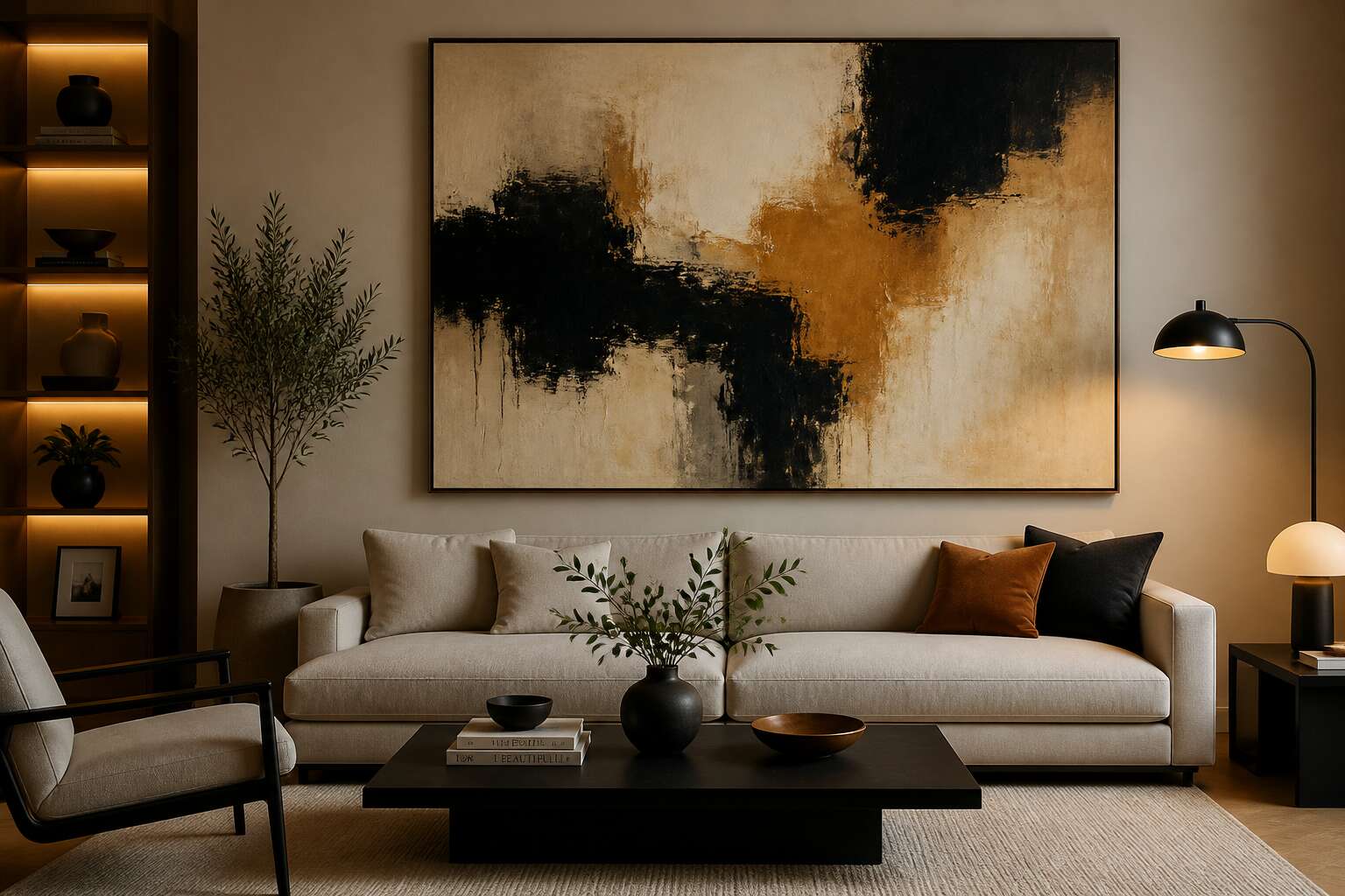
Defining Your Aesthetic
Contemporary and Modern Styles
The most persistent misconception in interior design is that ‘modern’ and ‘contemporary’ are synonyms. Modern wall decor art emerged from the Bauhaus movement, favoring clean lines and deliberate balance. Contemporary art, however, captures the present moment, using current materials and themes. This difference changes how you select pieces for your space.
When I work with clients in Johannesburg, I ask about their emotional baseline. Do they prefer the calm of symmetry or the energy of raw texture? The answer guides the selection.
- Modern relies on structure and order.
- Contemporary thrives on experimentation and process.
Your choice ultimately defines the narrative of your room, its focus, and the interaction it invites.
Classic and Traditional Looks
Classic and traditional wall decor art requires a different patience. The pieces carry provenance, histories that long predate the walls they now inhabit. I have stood in Johannesburg homes where a gilded mirror seemed to hold the silence of three generations.
This aesthetic rewards patina over perfection. Colours lean toward ochre, deep mahogany, and aged brass. Framing matters more than the canvas, and symmetry acts as a quiet ritual.
- Oils with visible brushwork from established South African artists
- Botanical prints with faded, truthful margins
- Portrait miniatures that invite a second glance
Selecting this wall decor art means accepting that a room should feel inherited, not assembled. The effect turns uncanny. A hallway may feel as though it remembers a life you never lived.
Eclectic and Bohemian Vibes
Nothing kills an eclectic room faster than hesitation! I’ve walked into a Durban studio where a handwoven sisal basket shared wall space with a framed jazz poster, and it worked because nothing matched. That is the core of the bohemian mood: choice over convention.
- A carved wooden mask from a Gaborone market
- A watercolour bought from a street artist in Braamfontein
- A vintage textile stretched over a rough pine frame
Wall decor art in this style does not demand symmetry. It demands conviction. Mixing brass with raw rope, or faded prints with bold acrylics, creates a rhythm no catalogue can replicate. The wall becomes a collage of travels and obsessions, carrying the energy of unfiltered decision.
Sizing and Arrangement Strategies
Measuring Wall Dimensions
A single misjudged measurement can ruin an entire gallery wall. Before you commit to any arrangement, grab a tape measure and record the exact width and height of your bare wall. Then subtract the dimensions of any furniture beneath it, like a sofa or console, to find your true usable canvas.
- Measure from the baseboard to the ceiling or picture rail.
- Mark the center point of the wall in pencil.
- Use painter’s tape to outline each frame’s footprint.
That outline lets you test spacing without hammering a single nail. I usually leave 5 to 7 centimeters between frames for a cohesive flow. This method turns your wall decor art into a calculated composition.
Building a Cohesive Gallery Wall
Arrangement starts with your largest piece. It anchors the composition, and every other frame relates to it. For a cohesive gallery wall, I prefer establishing a consistent rhythm by repeating frame depths or colour tones. When a sofa sits below the display, the arrangement’s lower edge should hover roughly 15 to 20 centimetres above the backrest. This prevents the wall decor art from feeling disconnected.
Scaling matters. A small print lost on a vast wall reads as an accident. Match the total footprint of your wall decor art to the proportions of the space.
Three arrangement strategies work consistently well:
- The symmetrical grid. Equal spacing and identical frames create a formal, orderly presentation.
- The centred anchor. One large statement piece with smaller works radiating outward.
- The levelled baseline. Frames share a common bottom edge for a clean, organised feel.
The grid appears often in hallways and dining rooms. The centred anchor works above a fireplace. The levelled baseline tends to fit living areas best.
Placement Height and Spacing
Hanging wall decor art starts with a simple measurement. The centre of the piece should sit at eye level, about 145 centimetres from the floor for most South African homes. The rule shifts slightly above furniture, but the principle stays the same.
Spacing between frames matters too. I keep a gap of 6 to 8 centimetres between pieces. For larger pieces, the gap can stretch to 10 centimetres. Consistency matters more than the exact number.
- Sixty to seventy centimetres of clear wall space above a sideboard is a solid starting point.
- The total display width should cover about two-thirds of the wall surface.
- Painter’s tape marks the outer edges before you hammer a nail.
Sizing is a matter of proportion. A small print on a large wall looks lost. Match the footprint of your wall decor art to the wall, leaving clear space around the edges.
Making a Statement with Oversized Pieces
A single oversized canvas can define an entire room’s character. Recent South African interior surveys suggest that pieces over 90 centimetres wide are purchased four times more often for living areas than bedrooms. When I choose wall decor art for a large wall, I treat the piece as the room’s anchor.
The arrangement strategy shifts. You do not center the artwork against the furniture. Instead, you align it with the room’s natural sight lines, often off-centre for drama.
For oversized pieces that work:
– Set the bottom edge 20 centimetres above the back of a sofa.
– Leave 10 to 15 centimetres of clearance from the ceiling.
– Pair the canvas with a single sconce or plant, nothing more.
This approach converts a bare stretch of plaster into a focal point without the need for secondary decor.
Materials and Finishes to Consider
Printed Canvas and Framed Prints
Wall decor art gains its soul from the substrate, independent of the image. A printed canvas offers a woven, matte surface that absorbs light and feels painterly, while a framed print under glass delivers crisp lines and a polished sheen. The choice alters perception, depth, and even the room’s acoustics.
Finishes matter beyond appearance. Consider these common options:
- Matte laminate reduces glare and protects against fading.
- Glossy coating intensifies color but reflects ambient light.
- Textured canvas mimics brushstrokes for a tactile experience.
Framed prints often use acrylic or traditional glass; acrylic is lighter and safer for large pieces. In South Africa’s bright climate, UV-resistant coatings become essential to preserve vibrancy over years.
Sculptural Metal and Wire Art
Wall decor art in sculptural metal does not sit still. It catches the low Karoo sun and throws a web of shadows. Hammered copper oxidises into deep greens; blackened steel holds a grim permanence. Wire art, twisted by hand, gives the wall a nervous energy.
- Raw steel with a clear lacquer, preserving an industrial grey
- Powder-coated iron for a matte, dust resistant surface
- Anodised aluminium, which resists corrosion near the coast
Each material carries weight that printed work cannot copy. A bronze relief ages like an old bell. Galvanised wire shimmers with a cold whisper. For South African walls, these pieces command attention without shouting.
Natural Wood and Reclaimed Timber
Reclaimed timber carries a history that no new board can fake. Old Cape yellowwood, salvaged from demolished farmhouses, keeps its grain tight and its colour deep. For wall decor art, this material offers a warmth that stone or steel cannot replicate. I have seen saligna outlast every varnish applied to it.
Finishes matter as much as the wood itself. The surface will age differently in each climate. The Highveld dries wood quickly, while coastal humidity can swell untreated panels.
- Raw linseed oil, which deepens the grain without masking it
- Lime wash, for a chalky, sun-bleached appearance
- Hard wax, to protect while leaving the pores open
Each finish changes how light sits on the fibres. For wall decor art, a reclaimed beam with a matte oil finish reads differently from one with a glossy shellac. The room’s light and the piece’s mood shift accordingly!
Textile Weavings and Macramé
From reclaimed timber, we move to something softer. Textile weavings and macramé bring a different kind of wall decor art to a room. They absorb sound. They add texture. They also cover up that patch of damp you haven’t fixed.
Cotton, jute, and wool each behave differently. A wool weaving in a Joburg living room will keep its shape. A jute piece in Durban might sag and lose its form. For finishes, consider the fringe. It invites touch. It also catches dust with a tenacity that is frankly impressive. You can clean them, but you will need to be patient.
Key materials to consider:
- Recycled cotton, for a soft, muted palette
- Natural undyed jute, for a rugged, earthy feel
- Tencel or bamboo silk, for a subtle sheen
Macramé knots tighten or loosen depending on humidity. So your wall decor art shifts with Cape Town’s weather. It is a living piece. That is either charming or terrifying. I lean toward charming.
Glass and Acrylic Panels
From the tactile weavings, we turn to something harder! Glass and acrylic panels offer a different take on wall decor art. Tempered glass delivers clear, sharp visuals. Acrylic, or Perspex, is lightweight and shatter resistant. In South Africa, acrylic suits large formats because it is easier to transport and install. Finishes vary widely. A matte surface cuts glare. A frosted panel softens the view. Tinted acrylic adds a smoky depth.
Consider these finishes for your project:
- Matte coating to minimise fingerprints.
- UV resistant layer for Joburg’s harsh sun.
- Anti-static film for humid coastal homes.
The choice of glass or acrylic changes how the work interacts with light and space. I prefer acrylic for busy households! Glass for formal settings.
Mixed Media and Found Objects
Some of the most compelling wall decor art begins as something discarded. A rusted gear, a broken fence pallet, a cluster of vintage keys. Mixed media and found objects transform these fragments into layered narratives that hold attention across a room.
The materials themselves dictate the mood. Raw steel brings industrial grit. Aged timber offers warmth. Fabric scraps soften the edges. Combine them with paint or resin and you create texture that shifts under changing light, a quality that flat prints cannot rival. I find the unpredictability of found materials genuinely exciting.
South African environments demand attention to material behaviour:
- Coastal salt air accelerates patina on unsealed metal.
- Highveld sunlight fades certain dyes and papers.
- Humidity can warp untreated wood.
Each found piece carries its own history, and that history becomes part of the wall decor art you live with daily.
Personalizing Your Home’s Visual Story
Using Color to Complement Your Palette
In South African homes, the quality of light changes with the seasons, and your wall decor art should shift with it. When I select pieces for a room, I let the existing palette lead. A woven basket with burnt orange strands, a chair upholstered in dusty sage, a clay pot with cobalt glaze. These are the anchors. Choose wall decor art that borrows one of those exact shades, and the space will feel like one continuous statement.
Here is what to consider:
– Natural light alters hue performance at different times of day
– Warm undertones in furniture pair best with earthy art pigments
Color becomes how one room leads into the next. That is how you build a home that feels personal and quietly intentional, without ever shouting!
Incorporating Family Photos and Heirlooms
Faded sepia portraits carry a particular gravity. In a Johannesburg home, I once watched a great-grandmother’s photograph hold its own beside a contemporary beadwork piece. The contrast was arresting! Wall decor art does not always arrive from a gallery. Sometimes it surfaces from a drawer or a relative’s attic.
Family photos and heirlooms carry a weight that store bought pieces cannot. A worn leather bridle from a Karoo farm, a grandmother’s hand mirror, a child’s first school portrait. Arranged thoughtfully, these objects become wall decor art with a layered narrative.
Consider what matters:
- A single oversized portrait can hold an entire wall
- Clusters of small frames work best when unified by one colour
- Heirlooms need breathing room; give each piece enough space
The result is a home that tells your specific story. That is a form of luxury no one else can copy.
Commissioning Custom Pieces
The most interesting walls in a South African home are not assembled from catalogues. They emerge from a conversation between a property owner and an artisan. This collaboration gives wall decor art a specific grammar. I watched a commission unfold in a Clifton apartment. The owner wanted the sea’s movement without a photograph.
An artist translated the swell into folded leather segments. It took months. The custom piece arrived, and the room was permanently changed! This is the value of bespoke. You sacrifice convenience for specificity, but you gain a crucial presence. Commissioning wall decor art means buying a narrative, not a product.
When commissioning custom pieces, define the constraints clearly:
- Specify the wall’s dimensions and light exposure at different hours.
- Provide a palette source, a fabric sample, a kerosene lamp from your family.
- Discuss the texture you want to touch versus the texture you only want to see.
The result is a document of a particular time and intention. It carries a trace of your household for years.

0 Comments